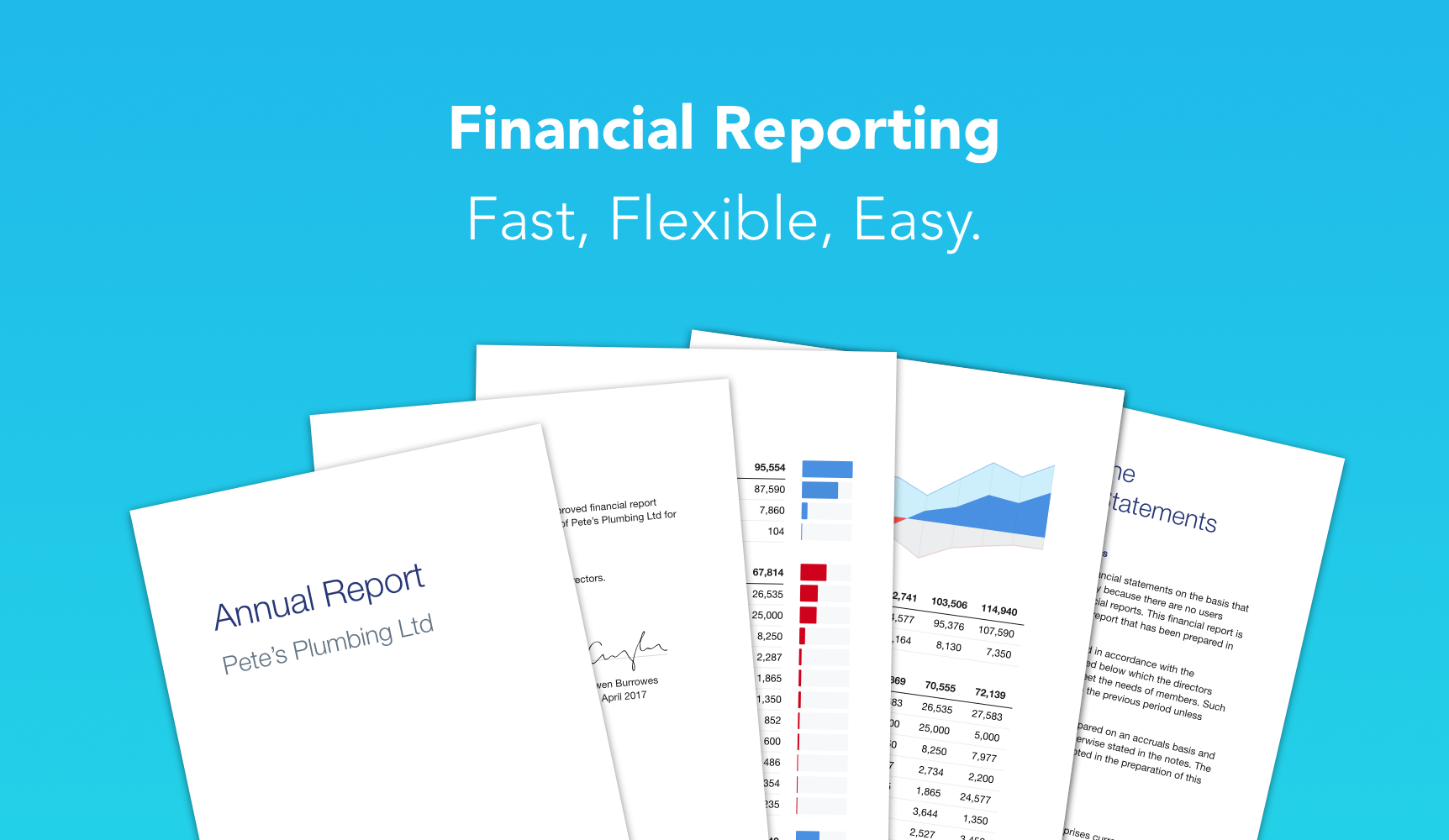
Background
As a product designer at Xero I was asked to redesign their financial reporting tools. With over 50 financial reports across a multitude of countries this was no simple task. The old reports didn’t allow much customisation and many customers found them too inflexible for their needs. The challenge was to allow greater flexibility while also improving ease of use.
A Common Framework
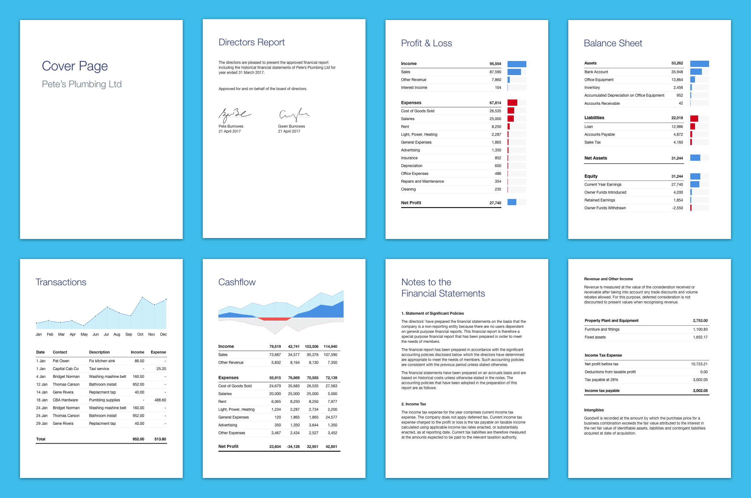
Rather than building countless one-off solutions, the new reports were built using a common framework. This approach helped enforce consistency. A single improvement could be updated across all reports, making ongoing development much easier. This also helped reports to look and behave in the same way. Actions such as changing the date, or editing text were the same regardless of the report. This consistency made things much easier for customers to learn and use.
Content and Actions
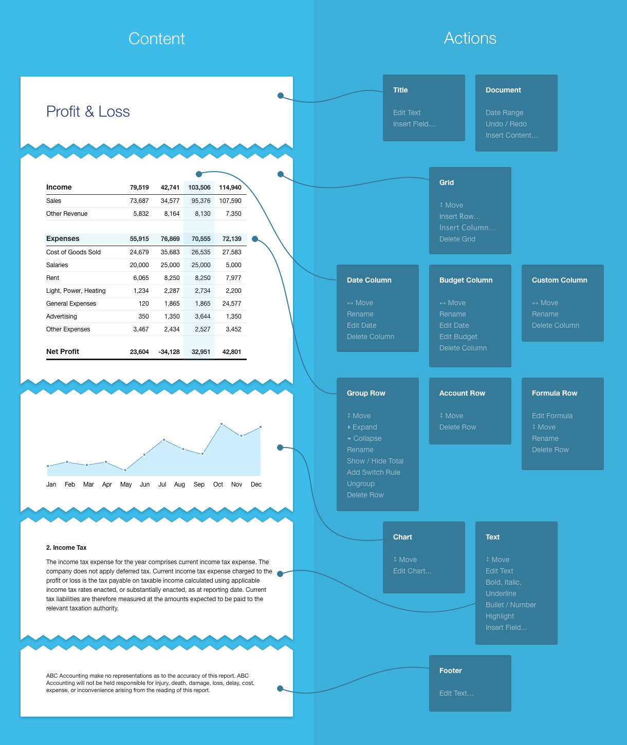
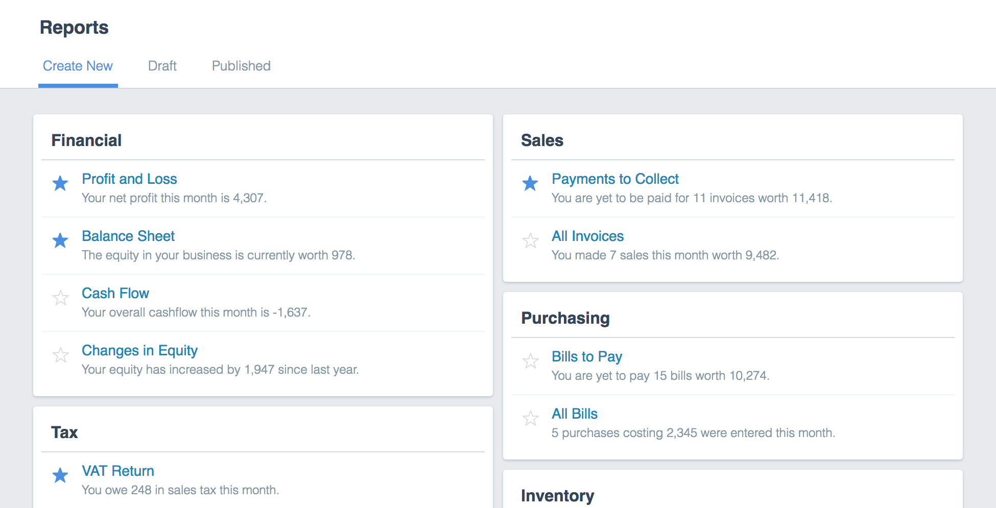
Given the document centric nature of the problem, the approach that proved the most productive was to firstly focus on the content required, and then the actions that could be performed it. For example, a grid is a type of content and the ability to position it relative to other content is just one way in which it can be manipulated. Before exploring specific interface solutions (such as dragging columns to reorder them) it helped to first clarify what content we should include and what actions users should be able to perform on it.
Guiding Principles
As the project developed I found myself referring to a common set of design principles to shape the framework and explain my design choices to the development team.
WYSIWYG
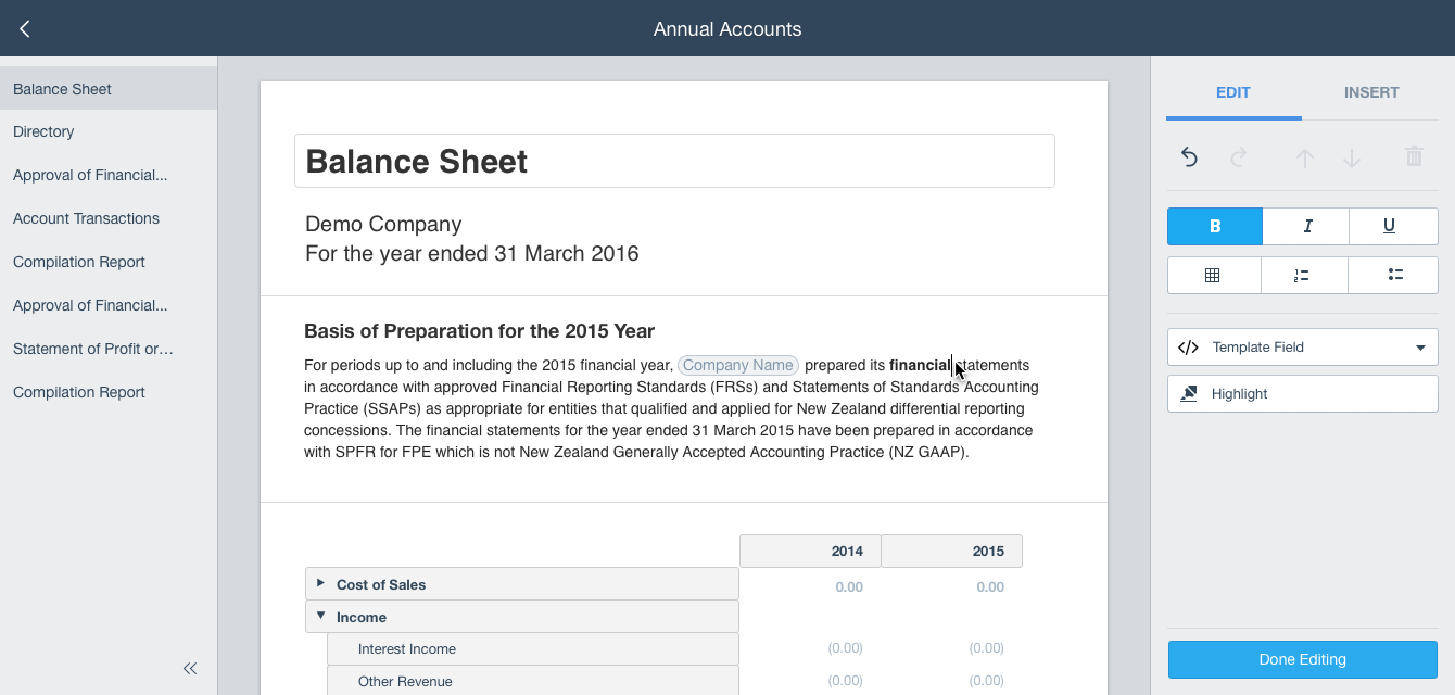
What You See Is What You Get. The editing interface should resemble the final output as closely as possible. The interface should always make allowances to achieve this goal, making a clear distinction between what is the document and what is the interface.
Direct Manipulation
In context / without needing to navigate to a different screen. V1 has far too much loss of context, and needless navigation to different screens.
Flexible Workflow
Natural / non-linear. Authoring a template should feel the same as editing a report. Same interface for the same actions.
Reduce Effort
Don’t make people repeat themselves. Content should be reusable, preferences should be remembered, and information should not be forgotten.
Consistency
The framework should be universal… No hacks where possible. If a report has special needs we should consider how to holistically meet these needs across the framework.
In Control
Our customers know best.
Prototyping
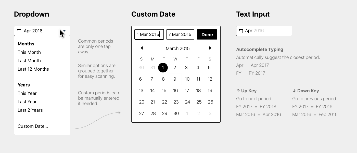
To quickly explore ideas I created a range of prototypes. From basic wireframes to highly interactive mockups, and HTML prototypes.
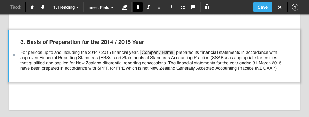
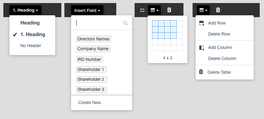
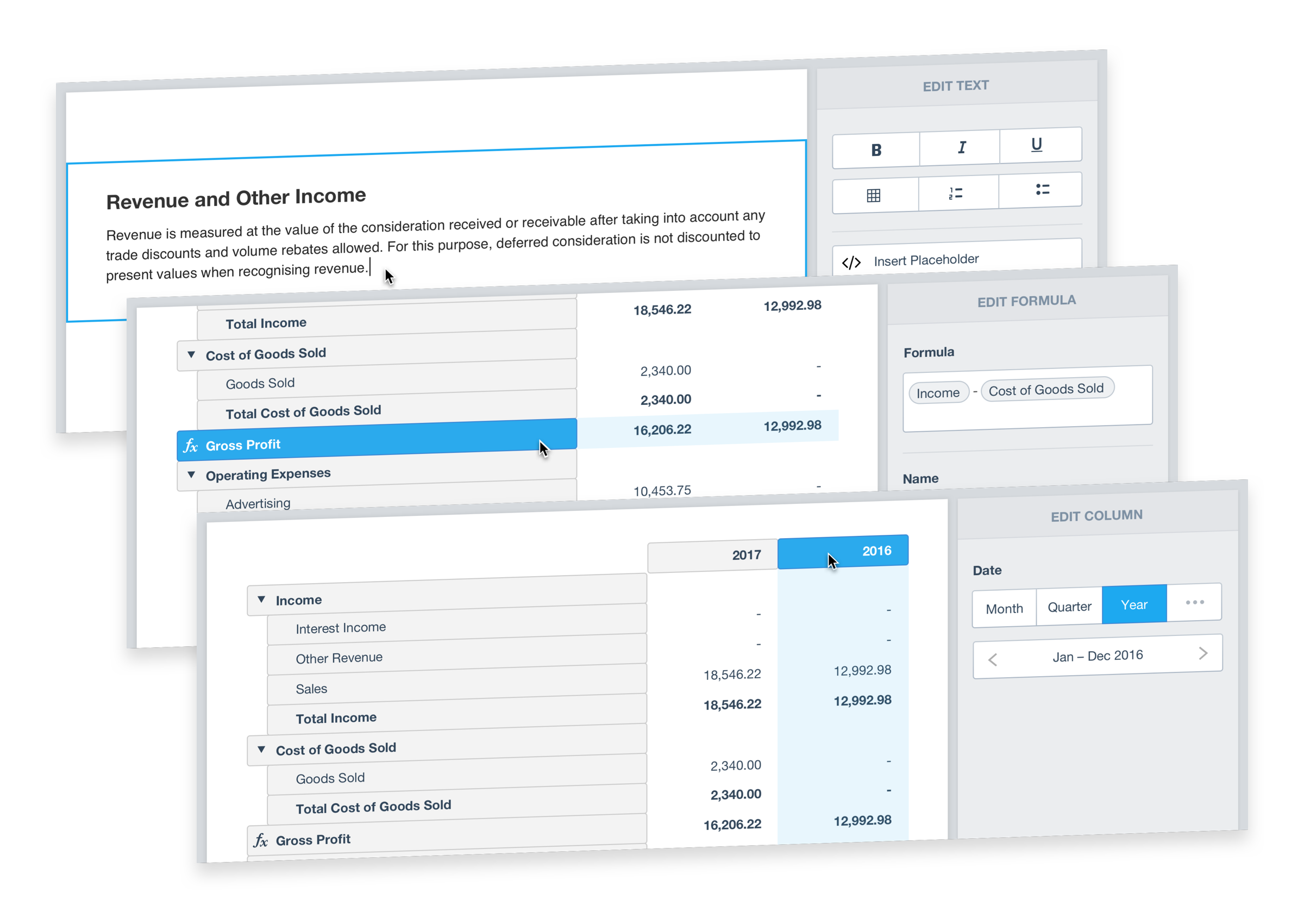
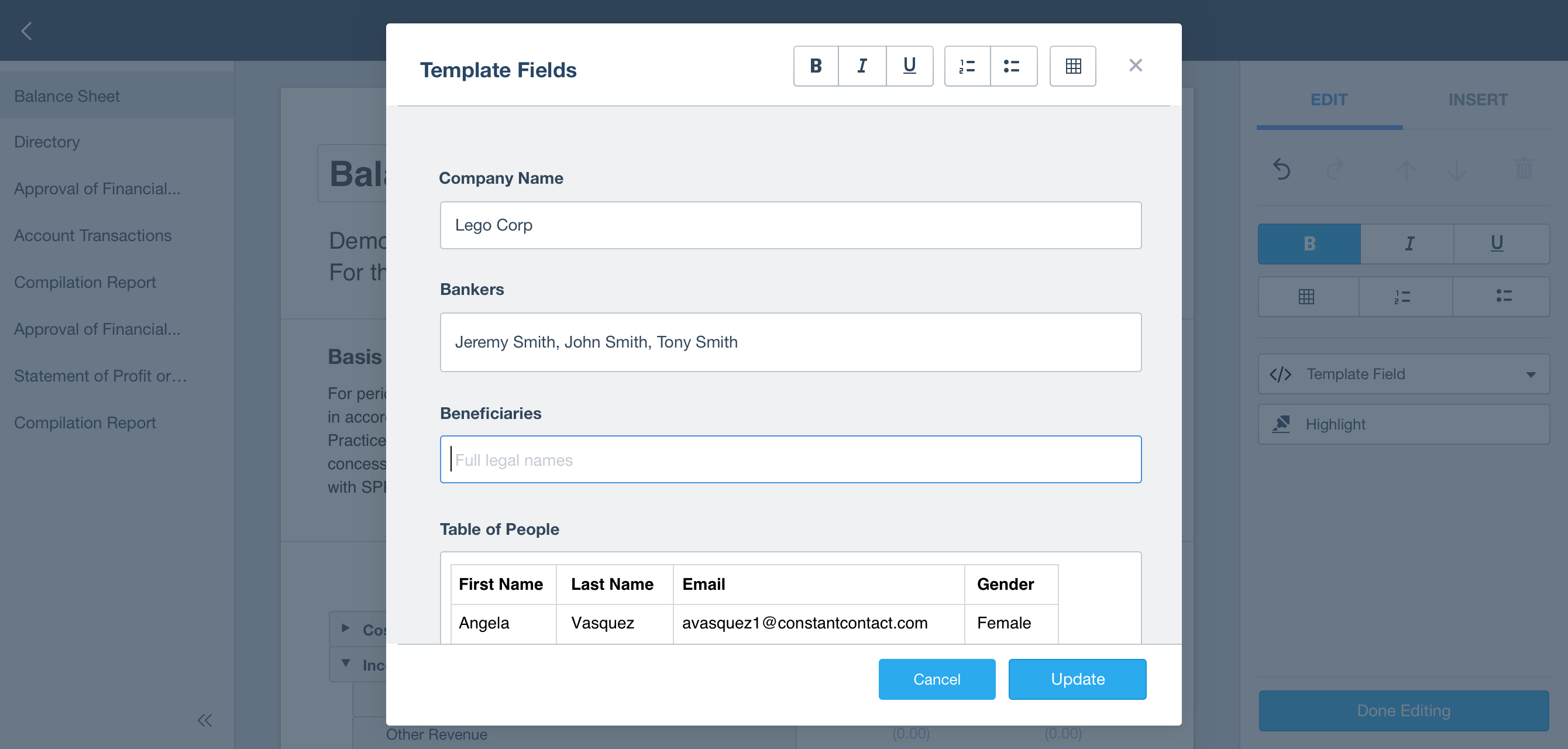
Selection Based Interface
The most complicated bit of functionality was the ability to completely customise the layout of any financial statement. Every row and every column could be customised. This gave accountants unparalleled flexibility. After much experimentation we managed to radically simplify the editing interface by only showing editing options when content is selected. This allowed a greater amount of functionality to be surfaced without overwhelming users.
User Testing
Prototypes and incomplete software were regularly tested with customers. Regular user testing helped to uncover issues early in the process and focus development efforts on the important stuff. Users were asked to complete high level goals such as preparing annual accounts, as well as smaller interactions like moving columns, editing text, or saving a report.
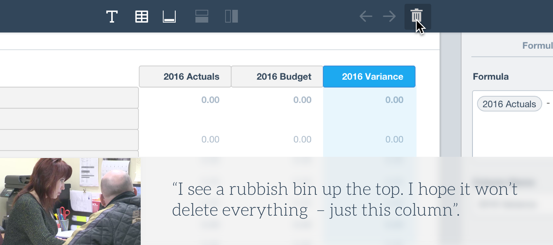
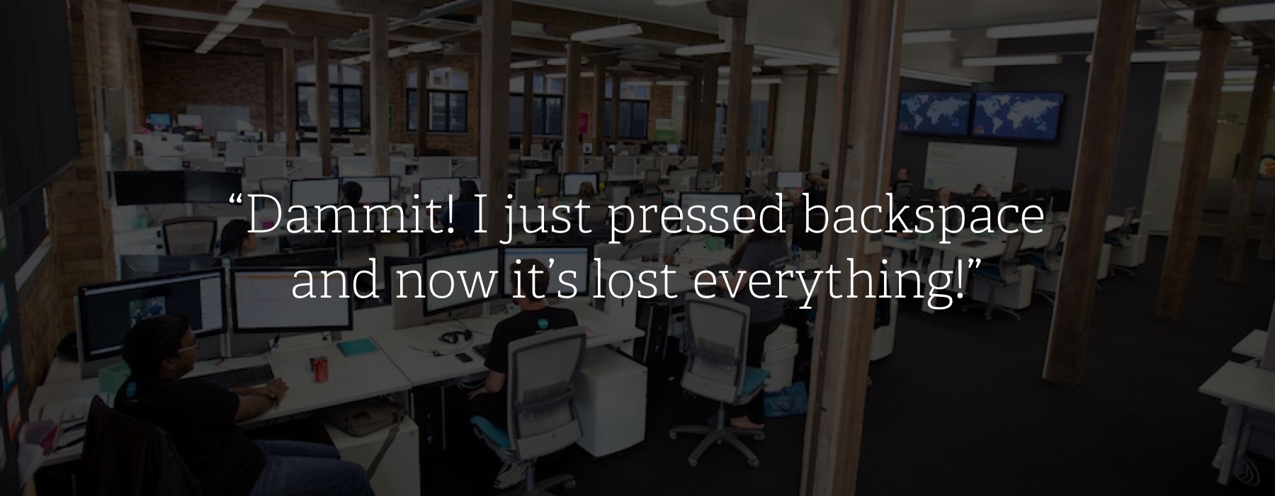
As well as testing on customers I also asked programmers developing the software to perform the same tasks as our customers. This gave them a much better understanding of how it would be used, often changing their views of what should be the primary focus. After experiencing the pain of inadvertently losing work, or performing tedious tasks, developers often put in extra effort to fix issues they might have previously blamed on user error.
Final Designs
After months of testing and development a major release went public in late 2016. This included a brand new editing interface that allowed users to customize nearly any aspect of a financial report.
The following video gives a brief overview of major updates to the product released in late 2016.