Background
When I started working at Mitsubishi Electric their website needed some love. It was challenging to navigate and a hassle to maintain. As the in-house marketing designer my job was to rethink the website. I conducted user research, restructured content, created visual mockups, and dabbled in code. The final result was a unified experience that was much easier to browse.
The Old Website
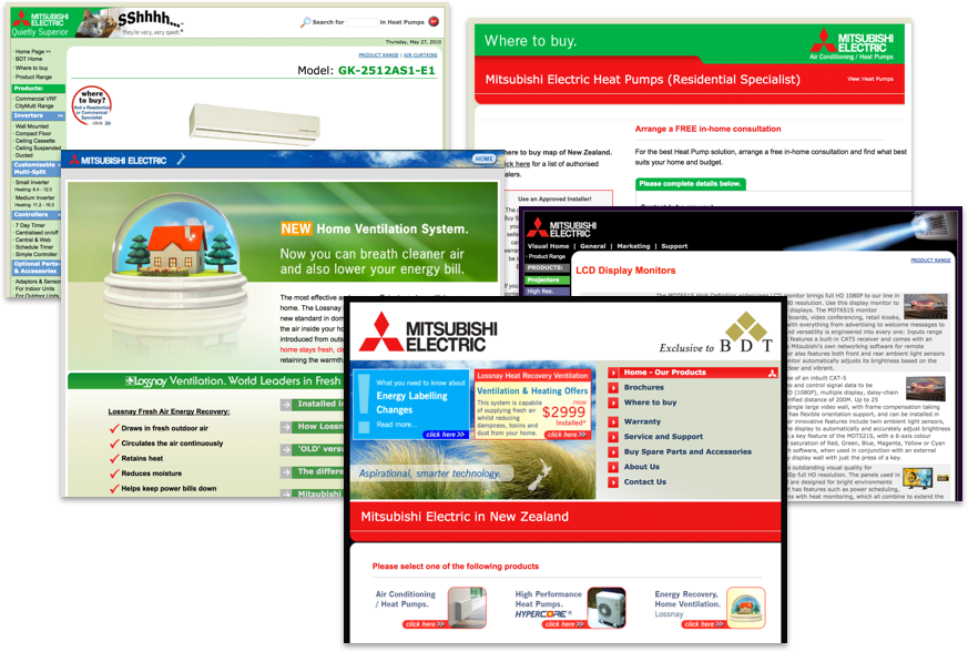
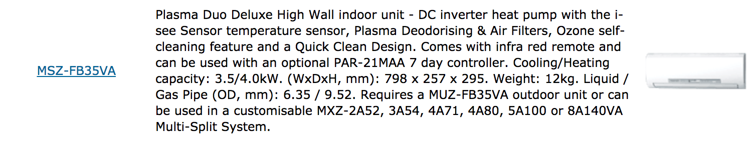
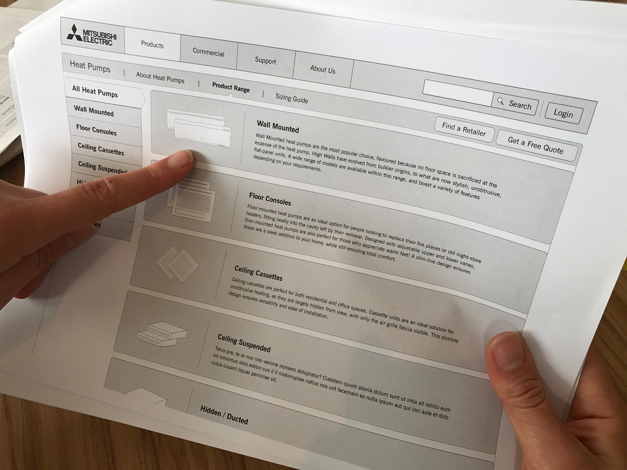
Early customer research highlighted key issues with the old website. It was unattractive, overwhelming, and hard to navigate. Product descriptions focused on technical specifications rather than customer benefits. There was very little product imagery and much of the text was redundant. This made it hard for customers to browse products.
Structural Design
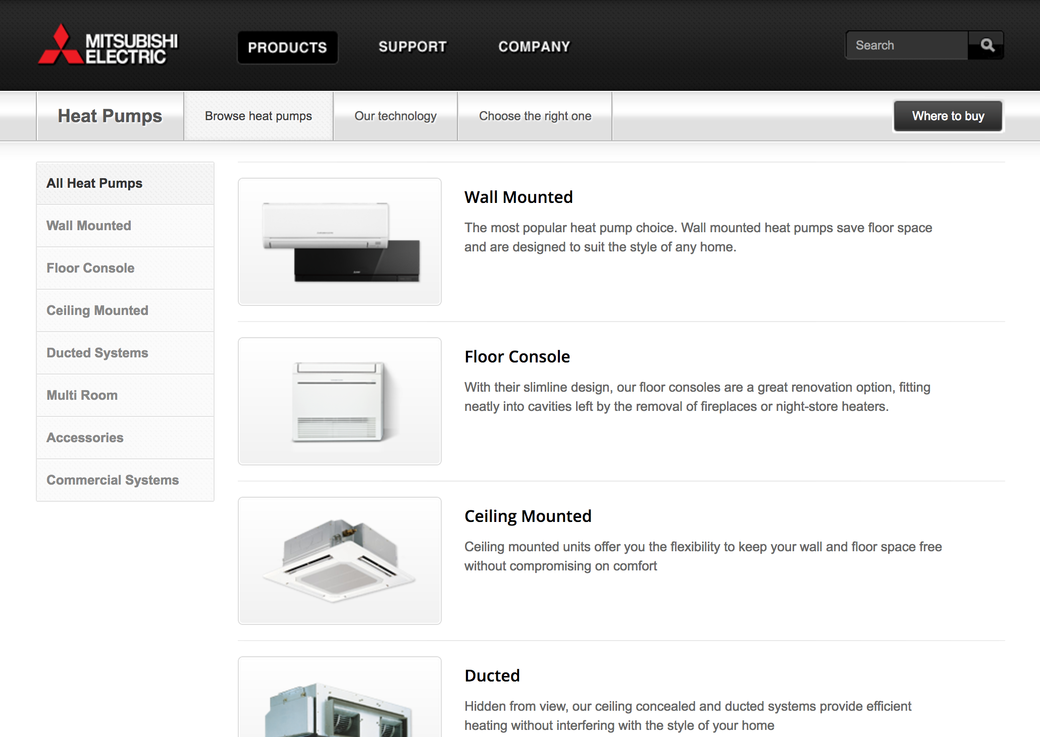
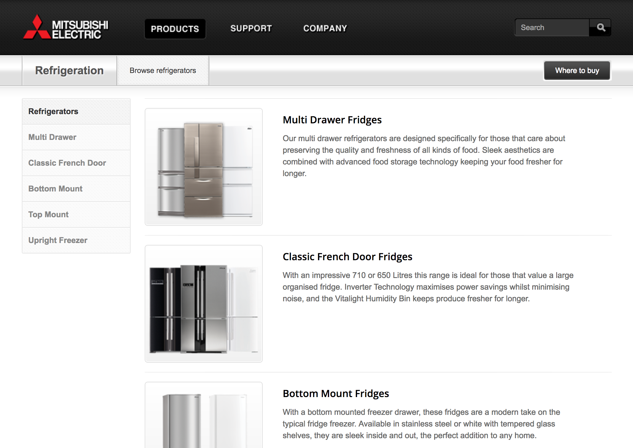
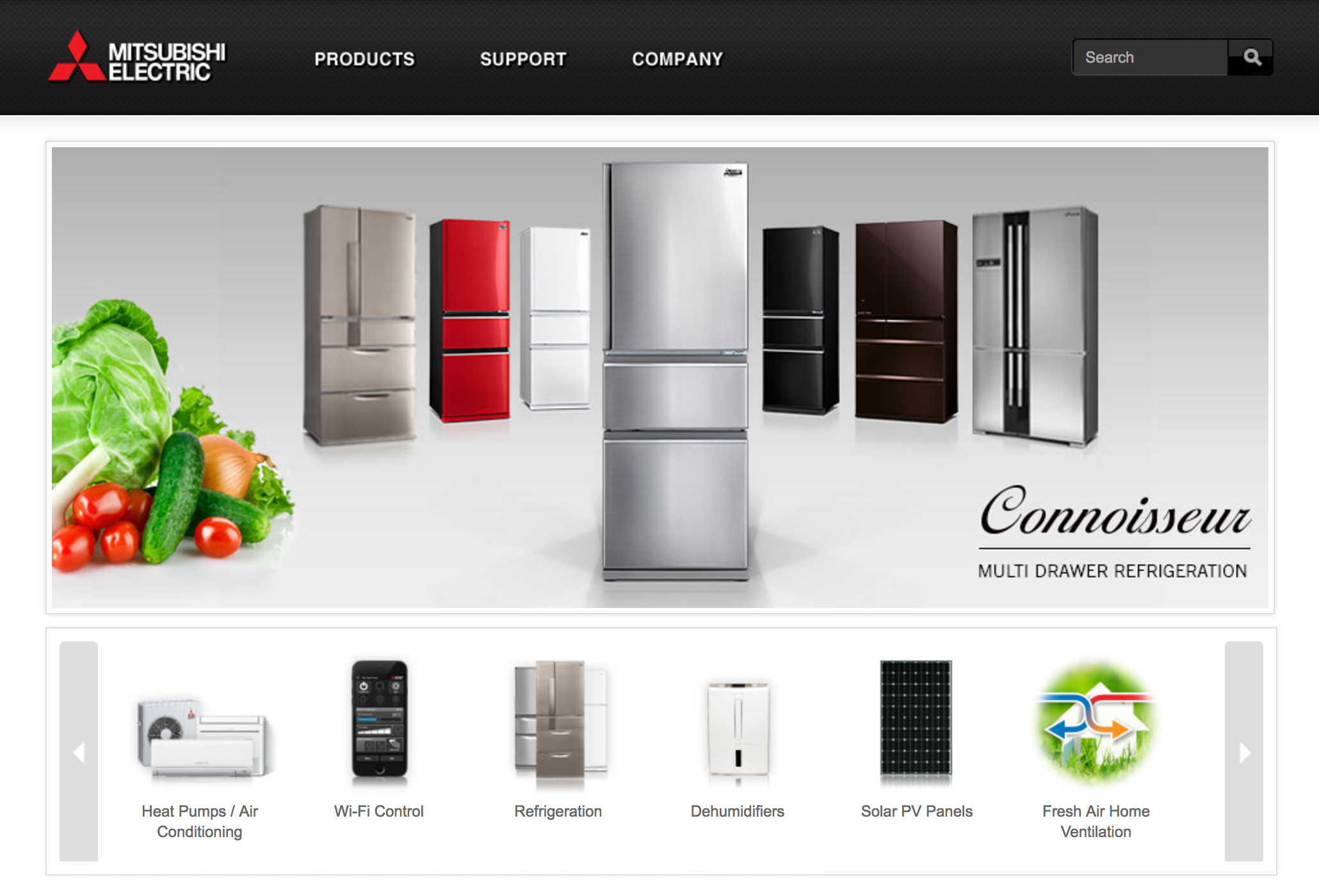
Heat Pumps and Refrigerators are the most popular items and so the website gives them focus.
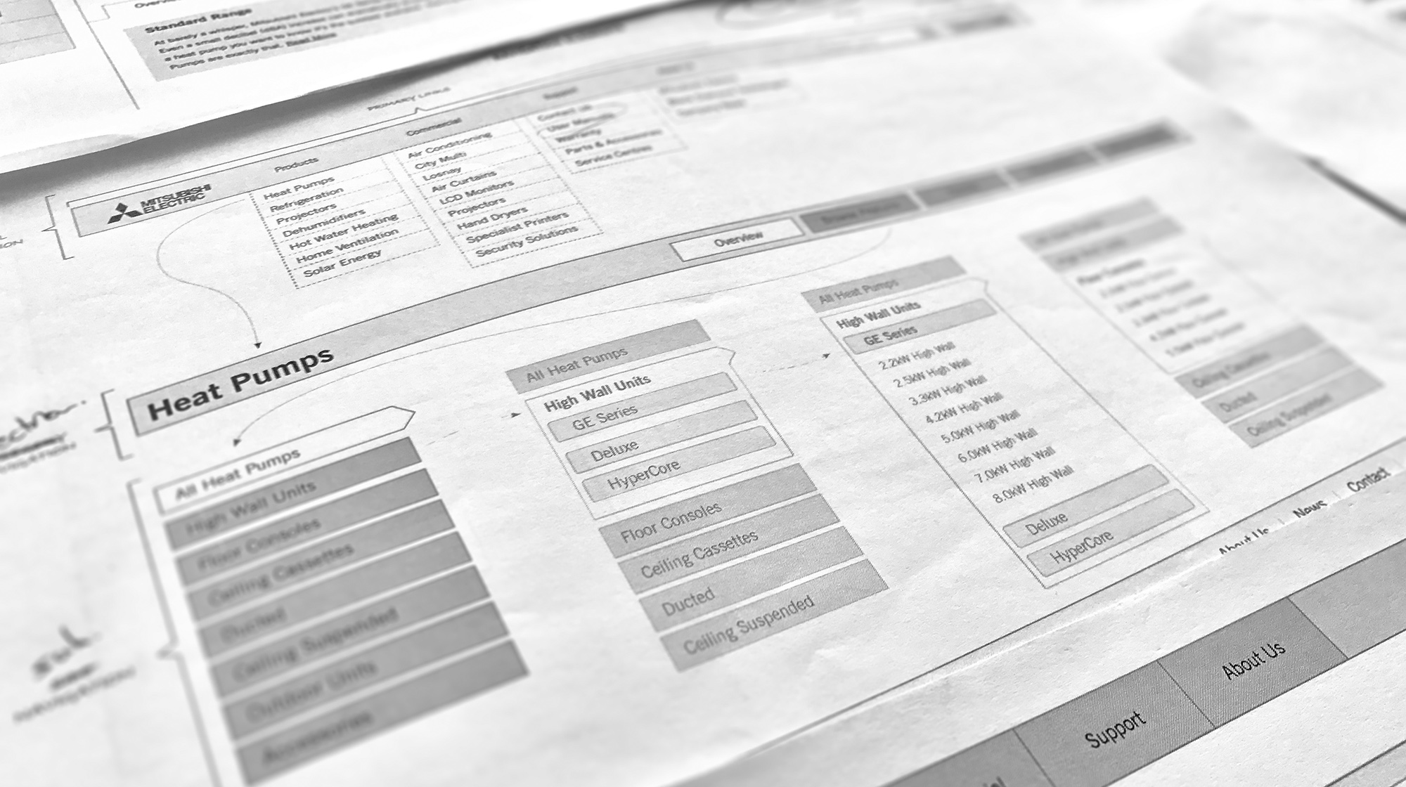
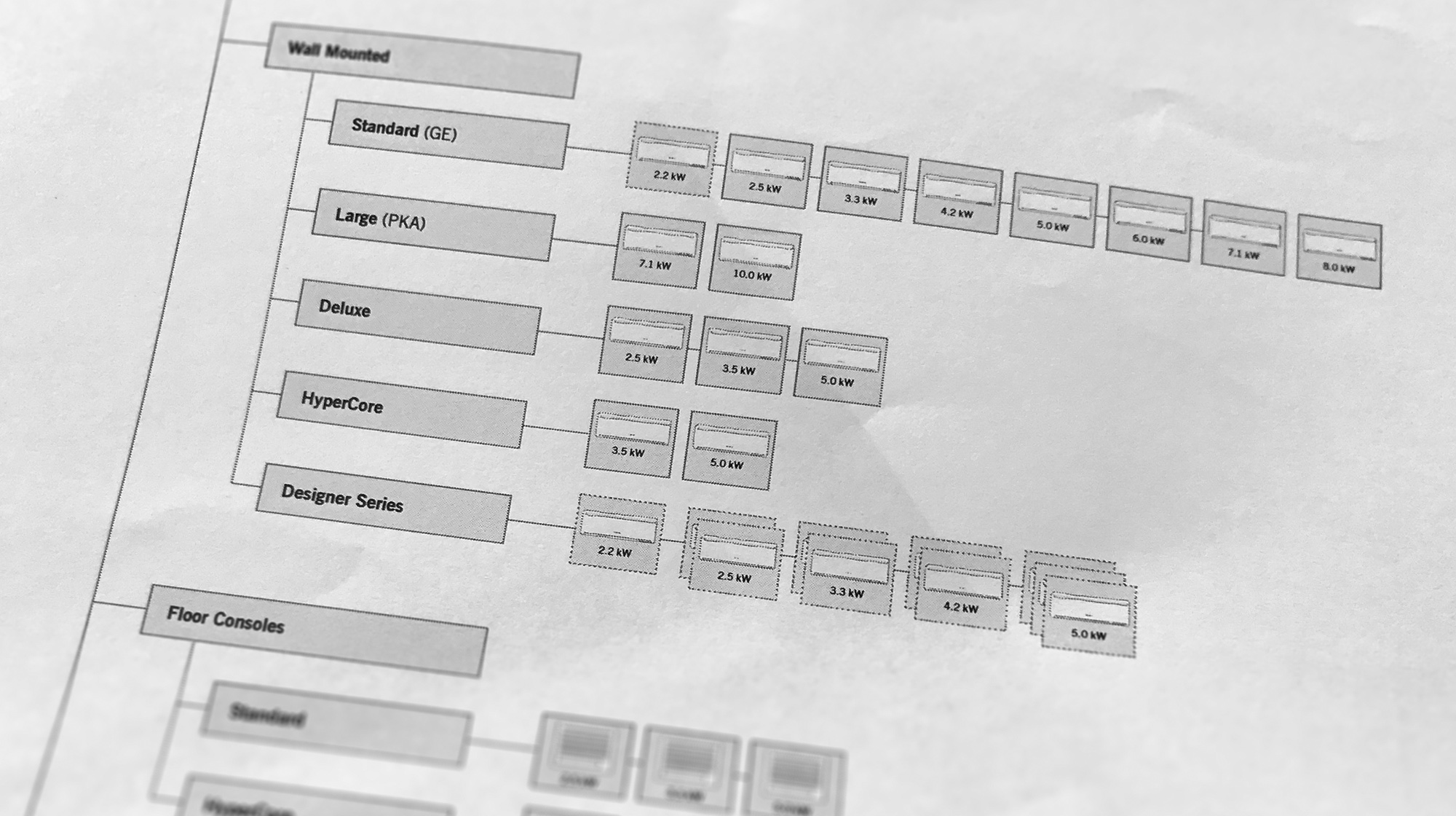
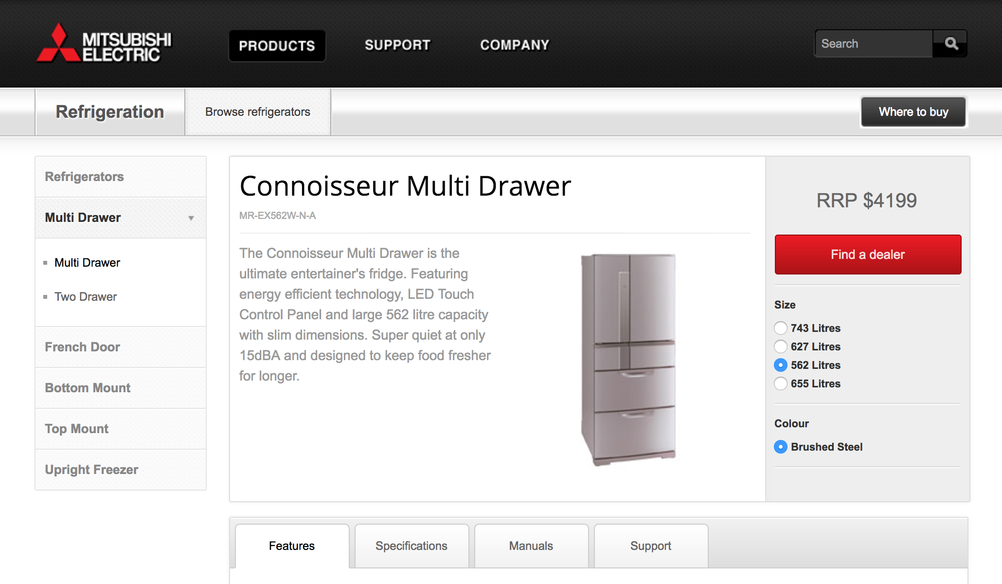
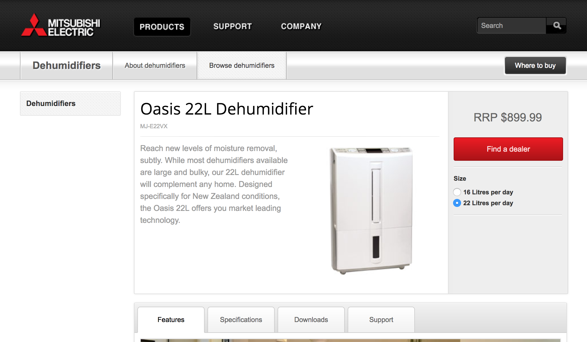
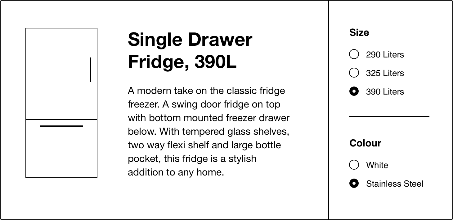
Previously every variation in size and colour was listed as a separate item. This made browsing products overwhelming. To address this we listed product variations as one item with multiple options.
User Testing
Content
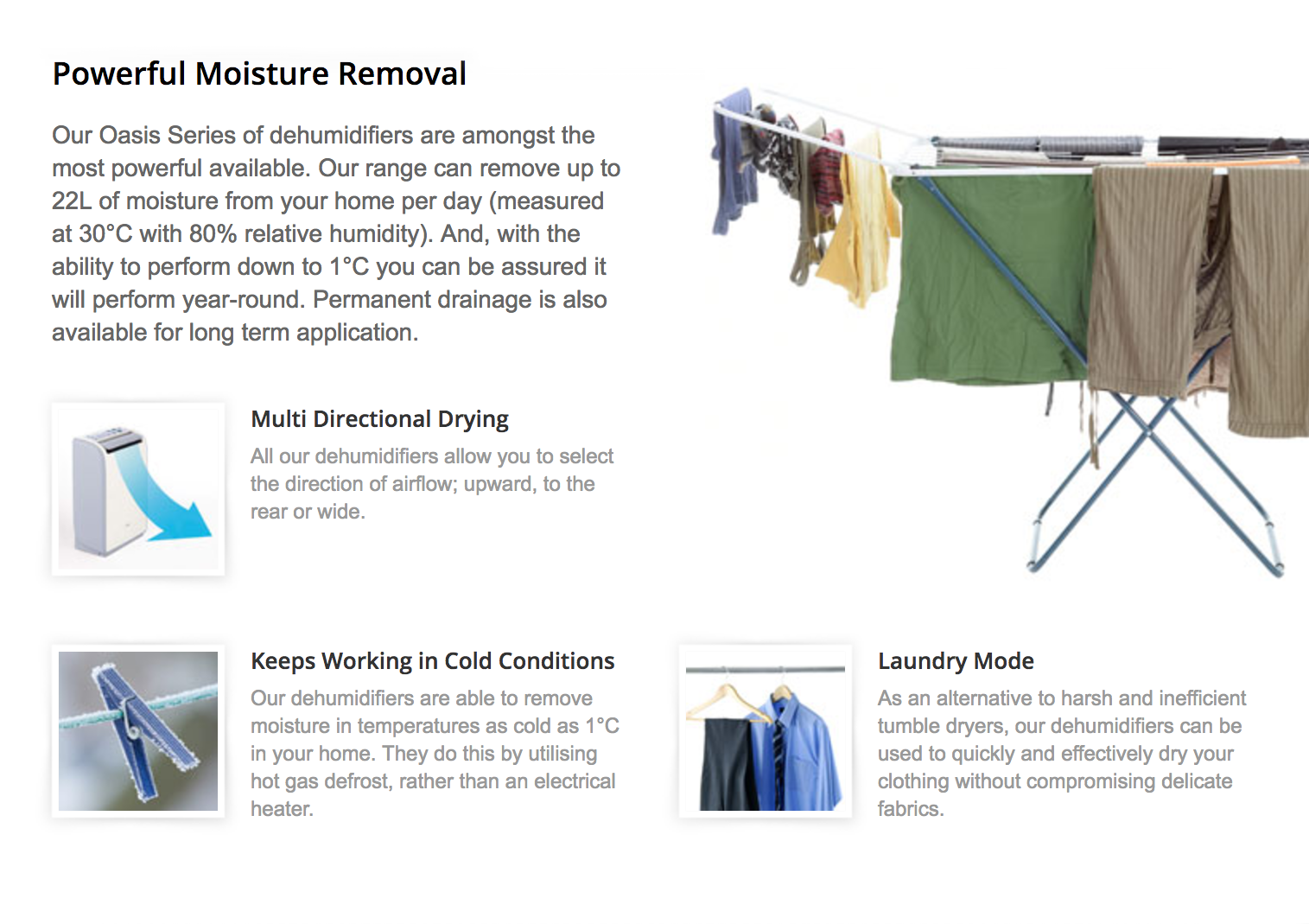
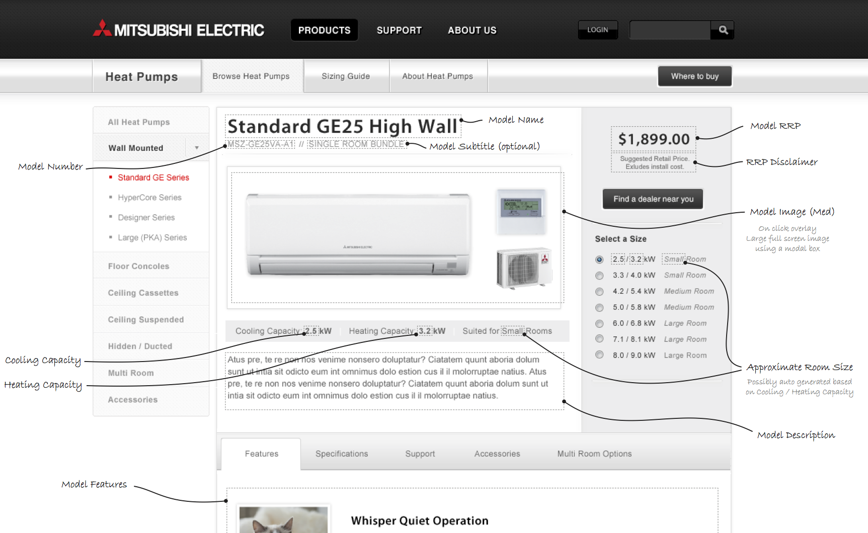
We removed technical jargon and highlighted the benefits that people care about. Product names such as ‘GL50’ were meaningless to customers. Staff knew the ‘GL’ series – it’s an energy efficient heat pump. But the name ‘GL’ didn’t help customers. So we gave products names such as ‘Standard’ ‘Eco’ and ‘Designer’ based on the language customers used to identify them.
Visual Branding
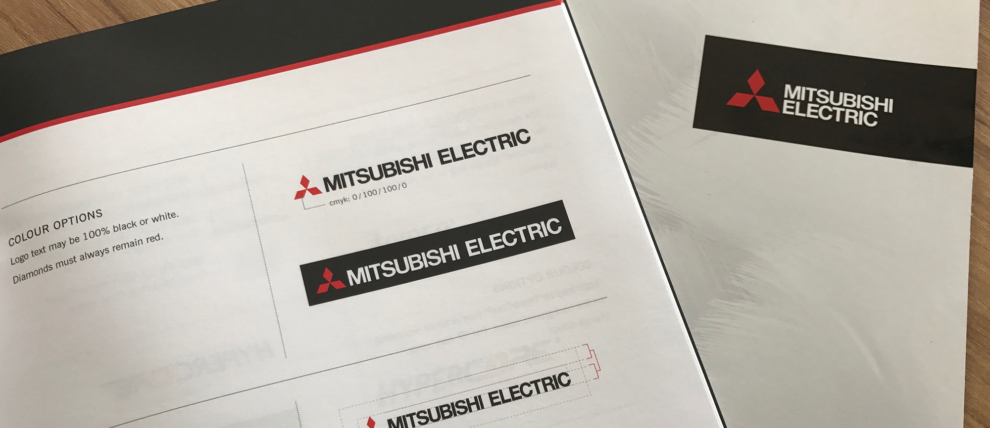
Mitsubishi Electric products aren’t cheap – they compete on quality rather than price. With this in mind, I helped refine their branding to portray them as a premium choice. The chaotic rainbow of colours was refined to white, black and a dash of red. High quality photos became a feature of the online experience, and everything was given much more breathing space. This made it easier for customers to digest the information, while also implying a sense of quality.
Final Result
The updated website: mitsubishi-electric.co.nz went live in early 2012.