Project background
At Geckoboard I'm involved with all things impacting the user experience. I work closely with software teams, conduct user research, design prototypes, and help spread empathy for users. This project focuses on improving the set up experience for first time users so they can create data dashboards with ease.
The challenge:
Make it easier to set-up a data dashboard.
Like many online software products, Geckoboard offers a free 30 day trial. A small portion of trialists end up purchasing Geckoboard at the end of their trial, but most trialists don’t. This highlights a key opportunity to improve. If a product isn’t immediately useful people are less likely to buy it. So the first time setting up Geckoboard is an essential experience to get right.
Mapping out the existing flow
Observing first-time users
To better understand the problem I led a series of user tests. We recruited potential customers that fit our target audience but had never used Geckoboard before. Participants were asked about their needs and then tasked with using Geckoboard to set up a dashboard. This was an open-ended task that highlighted the experience people have using Geckoboard for the first time.

Themes from user testing
It takes too long to create a dashboard.
After half an hour of using the product most participants had connected to a data source and added some metrics but no one had produced a dashboard that they were ready to share or display on a TV
It’s too easy to get distracted.
The current editing flow distracts users from getting set up quickly. Users get deep into advanced editing before experiencing the basic product. New users expected widgets to go to the dashboard, but we invite them to edit them which distracts from making progress.
People are concerned about data privacy.
Many users had worries about giving access to their data. They wanted some reassurance about data privacy when connecting to a data source.
Starting on the integrations page is confusing.
The current experience of dumping new users on the integrations page is confusing. People that navigated to the blank dashboard first had a much better context.
Adding multiple widgets is tedious.
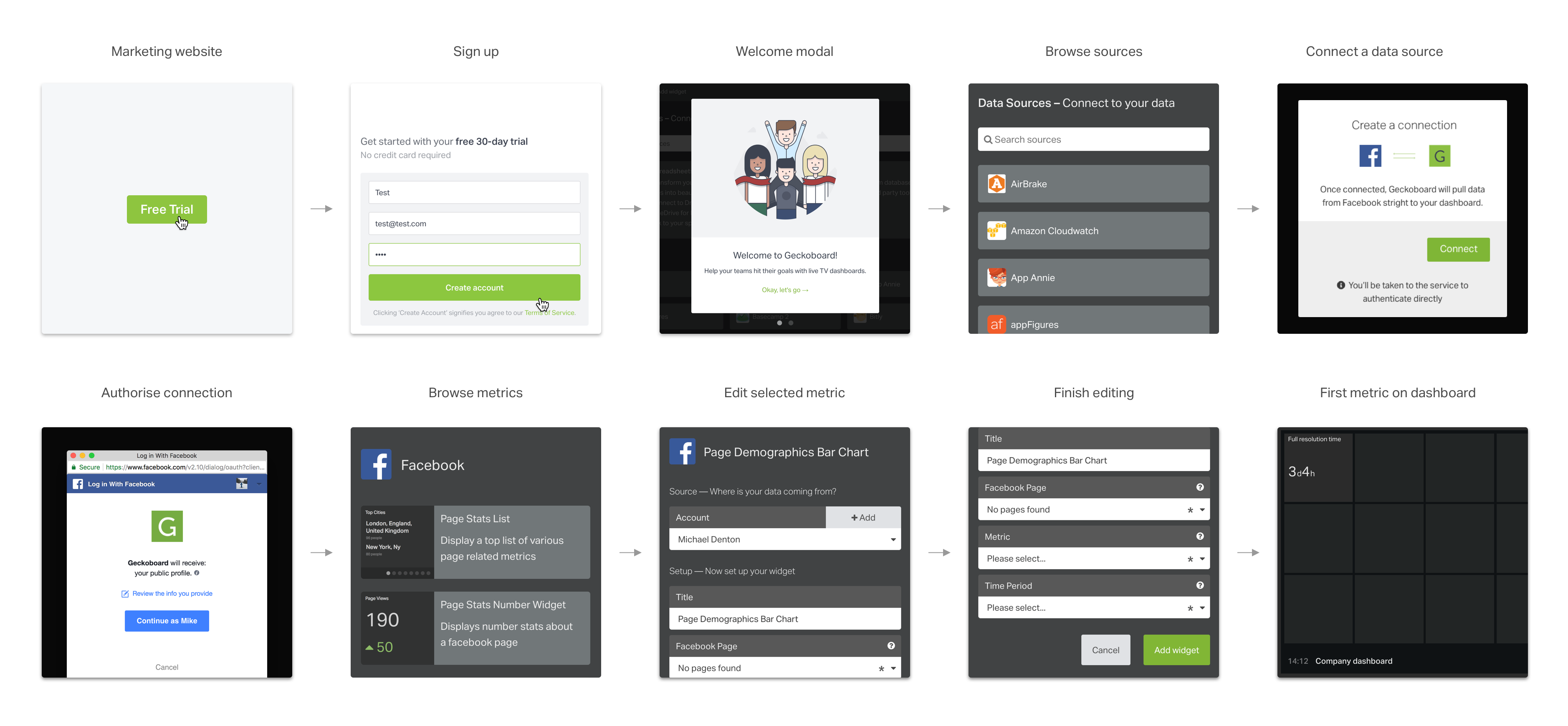
The widget-by-widget nature of building a dashboard makes the process of going from nothing to something feel tedious - especially if making lots of changes along the way. Just to add one widget the user has to go to the integrations page > then to the presets panel > then to the config screen > then to the dashboard.
Participants failed to share their dashboard.
The interface does not encourage users to display their dashboard on a TV. When participants were prompted to do this some end up confused by the language and the steps required.
Improvement 1:
Starting with a template
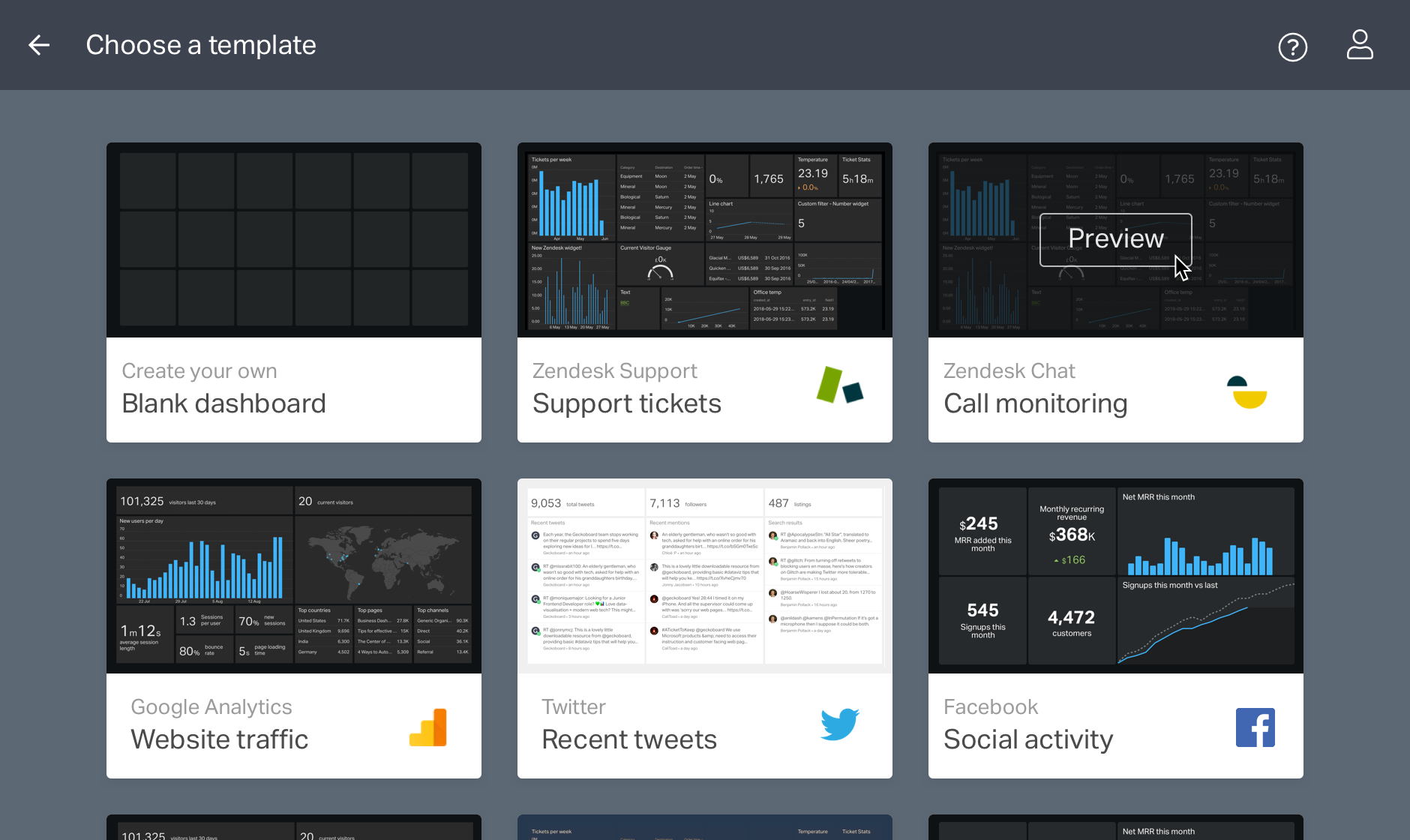
New users previously had to spend a long time creating a dashboard from scratch before they could experience the real value of Geckoboard. Offering pre-made dashboards radically decreased the time it took people to create a useful dashboard. Within minutes users could connect a data source and get a dashboard set up for most common situations.
Improvement 2:
Reassuring users when connecting data
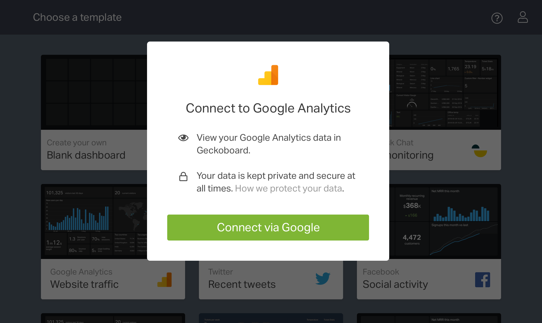
User testing highlighted concerns with data security at the point of connecting to third party services. Many participants where hesitant about giving us access to their business data. Data security has always been a top priority for Geckoboard and a great deal of effort is made to ensure that customer is data safe and secure. However first-time users don’t know this. A small text change on the connection window was enough to reassure customers and remove another point of friction.
Improvement 3:
Edit directly on the dashboard
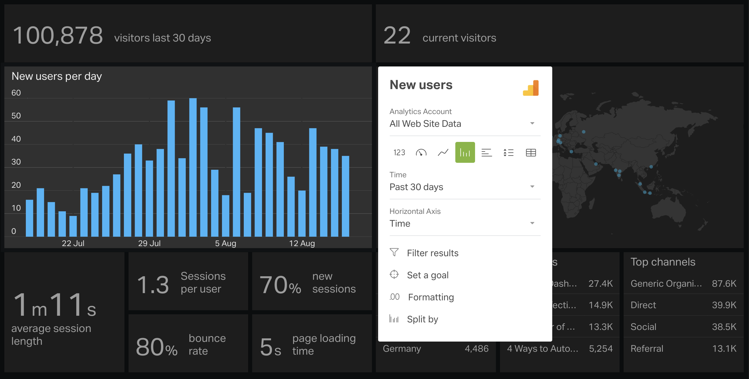
Editing a metric previously took users to a seperate screen. The process was laborious and people often got distracted. Participants would spend a long time exploring chart options rather than focusing on creating a dashboard. Changing the interface so that editing happens directly on the dashboard made the process much quicker. Users didn’t have to wait for another screen to load and they were less likely to get distracted as they remained in context.
Improvement 4:
Quickly adding content
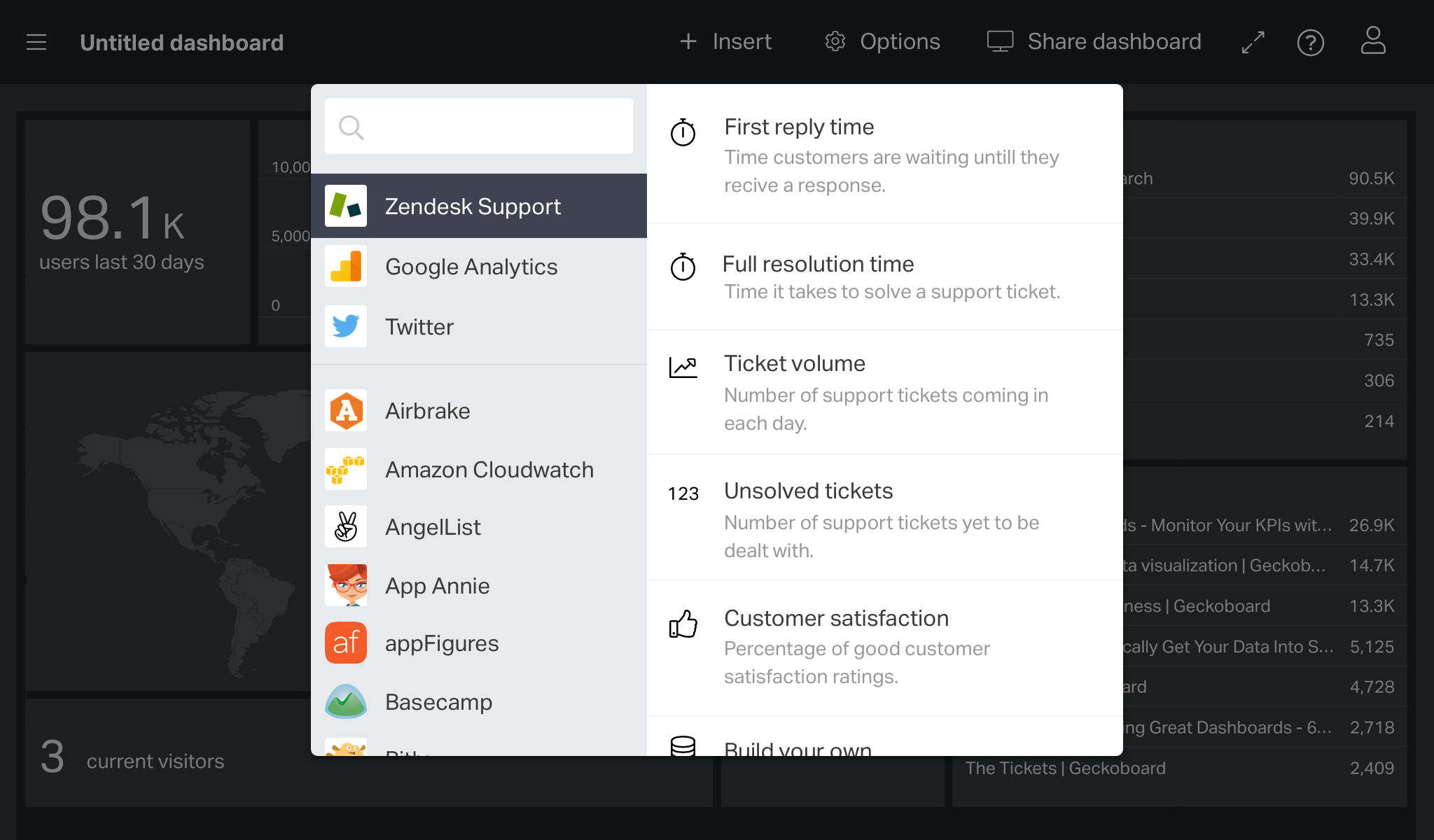
Inserting content previously required users to navigate away from the dashboard and step through two seperate screens. One screen to select the ‘data-source’ and another to select the ‘widget’. Combining this flow into a single split modal window keeps the user in the context of the dashboard. By defaulting to the last used service we also save the user from having to click it as this is what they want the majority of the time.
Improvement 5:
Prominent share and display options
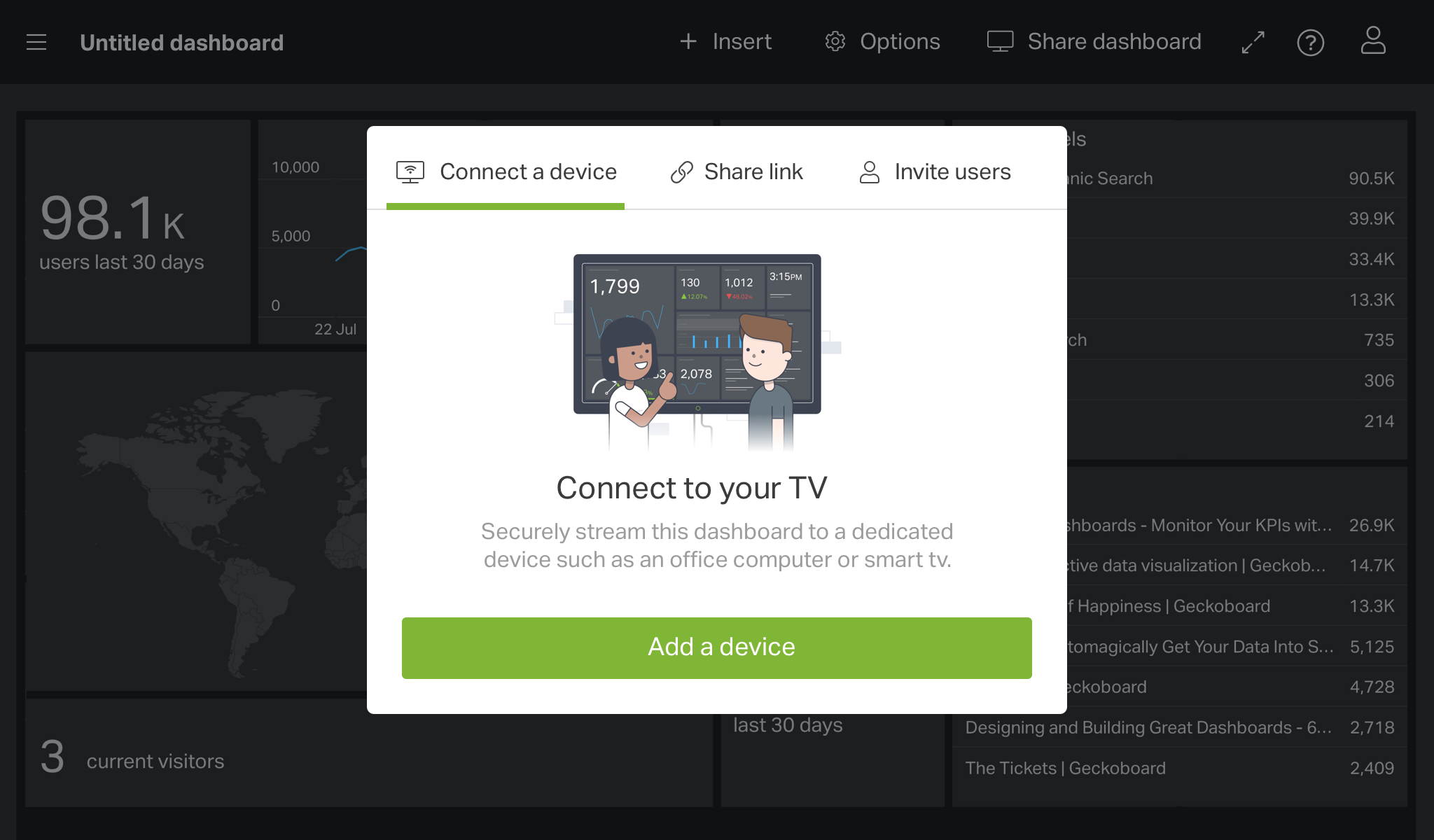
Previously the share and display options were scattered around the interface. People would use a sharing URL without knowing they could stream their dashboard to a TV. Surfacing all the options in one place aims to make users aware of how they can share their dashboard.
Continuing to improve the experience
We’ve learnt that simplifying the set-up process can have a big impact on the experience first-time users have. The first-time user experience is now a continual focus at Geckoboard with iterative improvements and regular testing. We want more trialists to create useful data dashboards so they can experience the benefits of Geckoboard.